MODULE 1, UNIT 1
Construction of Meaning
The Power and Delight of Picture Composition
Goal: Identify composition rules and practices for effective visual messaging.
You make aesthetic decisions every day: You decide what clothes to wear; how messy to leave your room; how to frame a smartphone photo; the size of the fonts you use; the margins of a document; and even how you arrange your food on a plate. You have developed, as human beings, everyday aesthetic impulses or instincts. Someone who is media literate goes beyond these everyday instincts and approaches aesthetic choices and creative problems of media with an educated perception, recognizing the range of choices available and why they choose what they do.
Color
You make color choices every day. Your mood often depends upon the colors with which you surround ourselves. You have strong associations with your favorite color(s), as well as the colors you interact with. For example, the color red is often associated with passion, love, and danger and is often used to symbolize revolution. In Chinese culture, red symbolizes luck, happiness, good fortune, success, and is tied to weddings and nationalism. Blue frequently gets associated with stability, serenity, inspiration, and wisdom, and is the main logo color for many corporate entities, from The Gap to Walmart to IBM. Green, the most significant color in nature, is connected to ideas about growth, health, youth, and fertility, and has been strategically deployed to communicate those ideas in logos for companies like Whole Foods, Starbucks, and BP (the oil company).
The importance of red
Creators have long used the color red purposefully and strategically, and the reasons are physiological as much as psychological. Color vision begins with the conversion of light, or the visible range of electromagnetic energy (360-780 nm) to photoreceptor signals. Humans are conditioned to see red quickly because their eyes are designed to block the opposite of red: the ultraviolet electromagnetic waves that harm eyes; the highly specialized cornea shields eyes against ultraviolet light.[1] Meanwhile, 60 percent of all cones in the human retina are more sensitive to red and yellow (or longer) wavelengths, compared to only 30 percent to green-sensing (or medium) wavelengths, and 10 percent to blue and violet sensing (or short) wavelengths.[2]
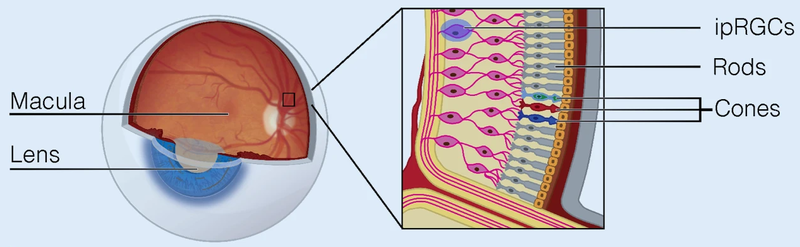
https://commons.wikimedia.org/wiki/File:Overview_of_the_retina_photoreceptors_(a).png.
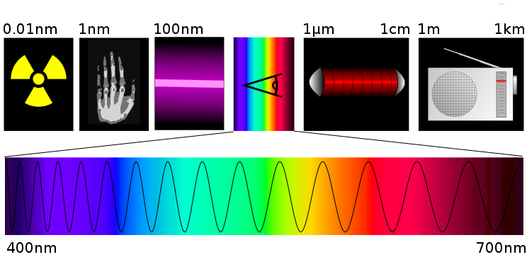
Spectre.svg, by Tatoute and Phrood~commonswiki, CC-BY-SA 4.0. https://commons.wikimedia.org/wiki/File:Spectre.svg.
Consequently, it’s harder for people to see violet or purple, and very easy for most people to see red, simply because red and orange light wavelengths pass through the retina more easily. Some scientific studies suggest that humans have evolved to have red sensitivities to better pick out the red berries in a bush or tree.[3] Regardless, people use red today – a color that jumps out at us – to indicate significance or danger.
It’s no wonder that highway safety standards around the globe settled on red for stop signs and stop lights.[4]
Graphic designers and photographers also know to use red as a strategic accent color that leads the eye to a certain part of an image. If you want to say “Look here! Look at this boy fishing!” as in the photo below, the suggestion is to use red against a cooler color for highest contrast. While red pushes forward, blue recedes, creating pop as well as the gratifying illusion of depth.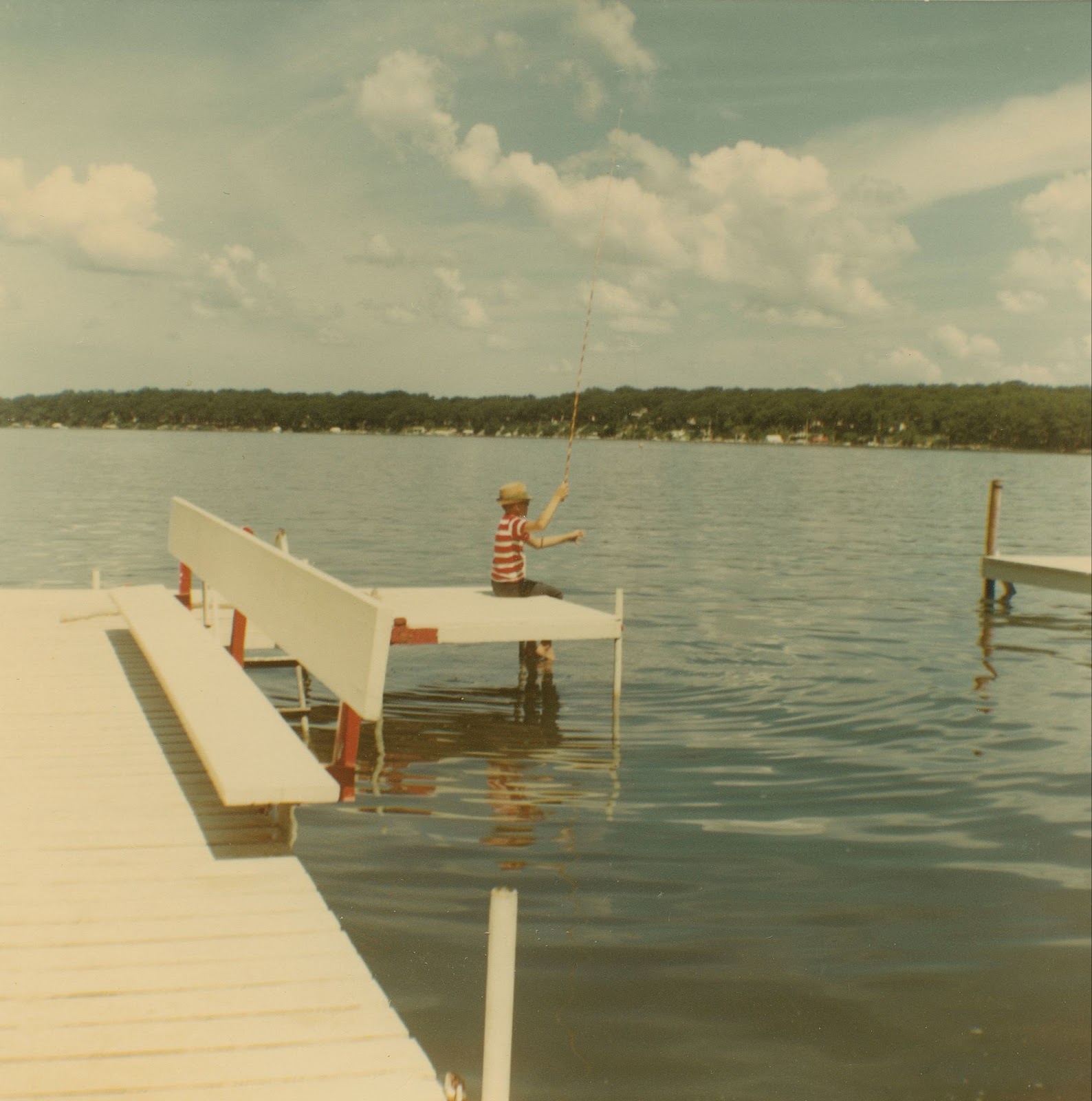
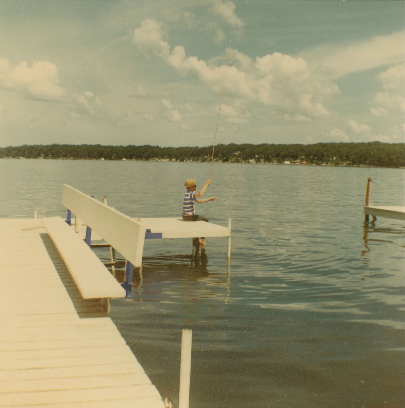
Consider this variation of the same image. Without the red, other aspects of the image come to focus, like the extraordinary clouds, which the fishing rod seems to point towards.
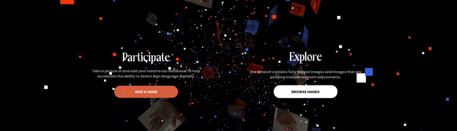
Color, used wisely (especially red tones), can help shape meaning by directing viewers to the parts of the image you want them to notice. In the world of graphic design, red might pop for a key message in an advertisement; serve as an easy-to-find “contribute” or “start” button on a smartphone app, or work as a subtle and pleasing design element on a webpage.
In the website below, the graphic designer plays with various shades of red (which pop) and blue, which recede to create a feeling of depth and orientation. The red “Give a Hand” button is a call to action. Explore the site further at https://www.giveahand.ai/.
ACTIVITY Photo composition analysis Go to New York Times’ Lens (https://www.nytimes.com/section/lens), which showcases the Times’ best photojournalism, or the Awwwards website (https://www.awwwards.com/websites/), which showcases the best web design. Search through either photos or web projects and examine the way color is used in either photography and design, or both. |
Form
Form refers to the shape of an item, and its relationship to other items, inside a frame. Where the object(s) or subject(s) are placed within a four-sided frame influences your experience and interpretation of that image. It could be a big dot or a small person, it could be a singular form filling the frame or many forms scattered like seeds.
For example, this bonneted woman from 1875 has all the elements of the human form within a frame: two eyes, nose, mouth, head on a neck, set on shoulders.
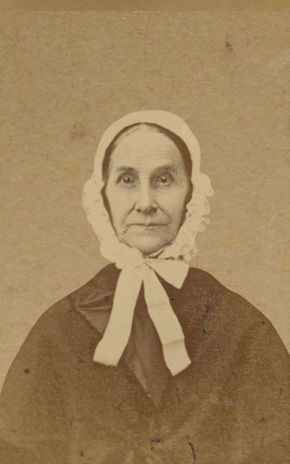
“FI0002293,” Washington, IA, 1875 by Susan Adam/Fortepan Iowa, “https://fortepan.us/photo/FI0002293/,” CC-BY-SA 4.0
Viewers recognize the human form. In many ways, form represents the creation and fulfillment of an appetite.[5] Exposure to human bodies across time creates an expectation of what human bodies possess. When encountering a new body, we assess whether it fulfills the expectation of form. Even when some elements are missing, say in a Picasso painting or child’s drawing, if enough are present, then we can figure out the image is of a human, or something else.
Placement of the form is hugely important in constructing meaning. Note how the bonneted woman is centrally placed, with even distribution on all sides, and her eyes–the point of most interest in this photo–are in the very middle of the frame. This placement makes something happen to your interpretation: Why does the bonneted woman seem inert or impotent, like they can’t move? Like they are trapped?
The answer is frame magnetism.
Frame Magnetism
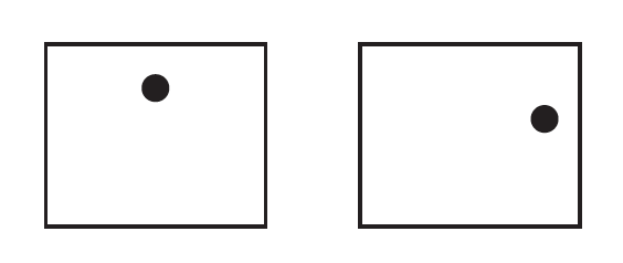
When you enclose any form or forms inside a 4-sided frame, the frame suddenly exerts a forceful pulling power over them, pulling the form over to its side.”[6] Centering a form renders it motionless, inert, or impotent because all magnetic forces are acting on the form at once, pulling in every direction.
An image closer to the top of the frame gets pulled upward; an image close to the right of the frame gets pulled to the right.
Interestingly, most people tend to center their photographic subject in the dead center of a photo. In doing so, they are rendering the form inert; nullifying the subject’s agency. For professional artists, photographers, and designers, centering is not a desirable photographic or design choice because it creates this energy void, and is also the “easiest” framing choice. But, perhaps an energy void is exactly the desired effect for the creator. Let’s play with the above portrait and see what effect different framing might have.
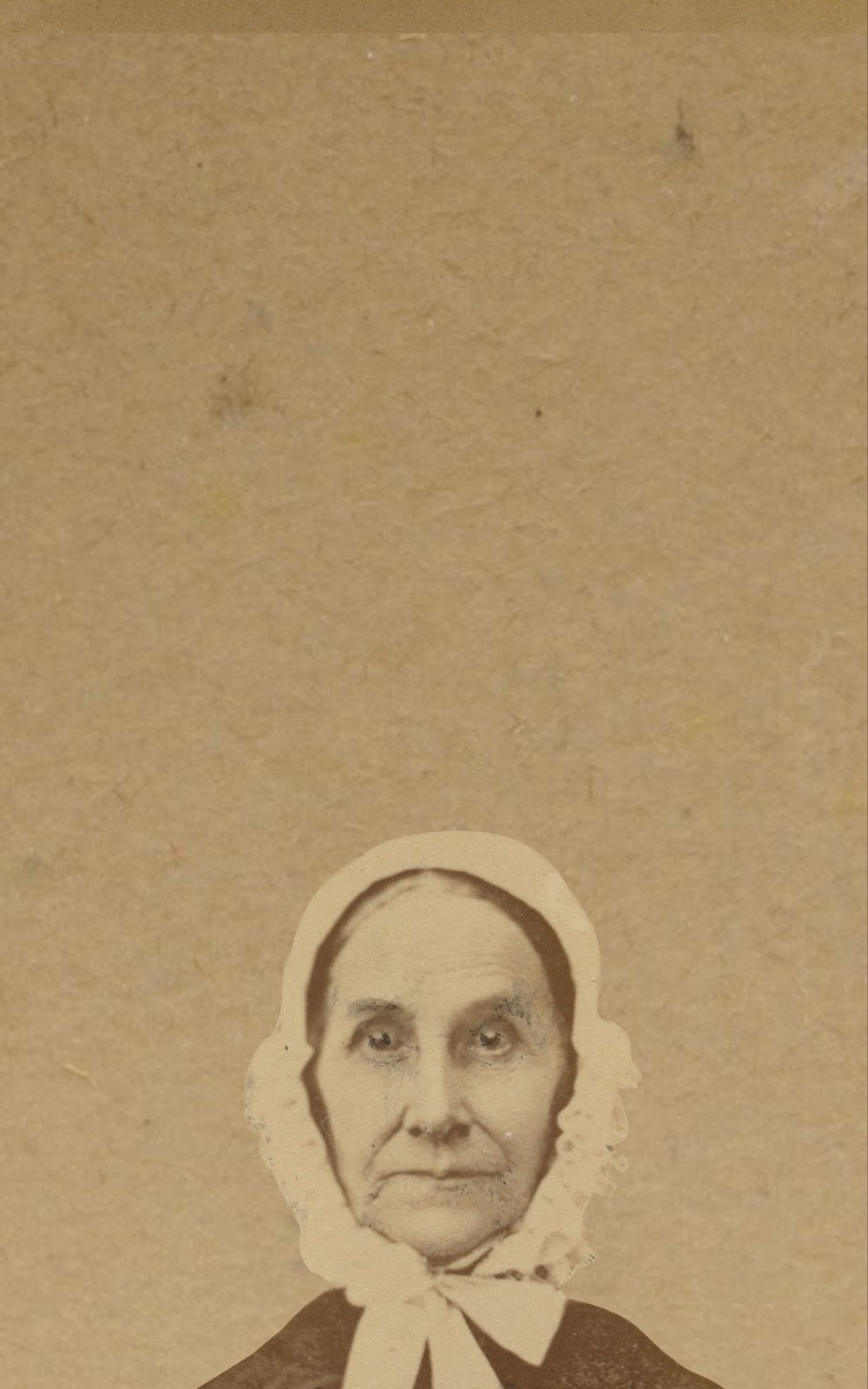
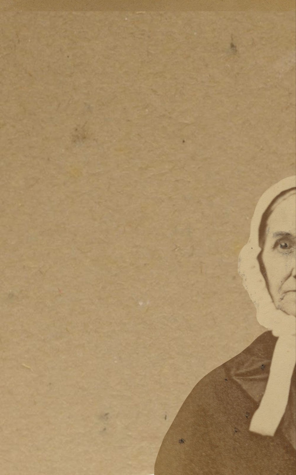
On the left, the bonneted woman is being pulled to the bottom of the frame; she looks uncomfortable (like she’s sinking). But maybe through this placement, there is even an element of humor. Likewise, on the image in the right, when she is pulled to the right, the bonneted woman suddenly seems to have agency, almost like she is peeking back at you, and is free to move further beyond the frame, turning into a person of intrigue.
Frame magnetism is essential to how you make choices in visual composition, but it’s also a way to create, convey, or read into the meaning of a visual text.
Framing, simply put, has the power to create additional layers of meaning. “We can use the pull of the frame to add drama or significance to our message,” co-author Bettina Fabos wrote. “We can create tension between two individuals, for example, by placing them close to the edges of each frame. Or we can do the opposite, framing figures so they are not pulled by the sides of a picture and are comfortably balanced within the frame.”[7] Aesthetic pleasure often comes from positioning objects or subjects so as to create a modicum of imbalance, but not too much (that is, minimize the magnetic pulling), so that we are interested (not bored), but also don’t feel too much tension.
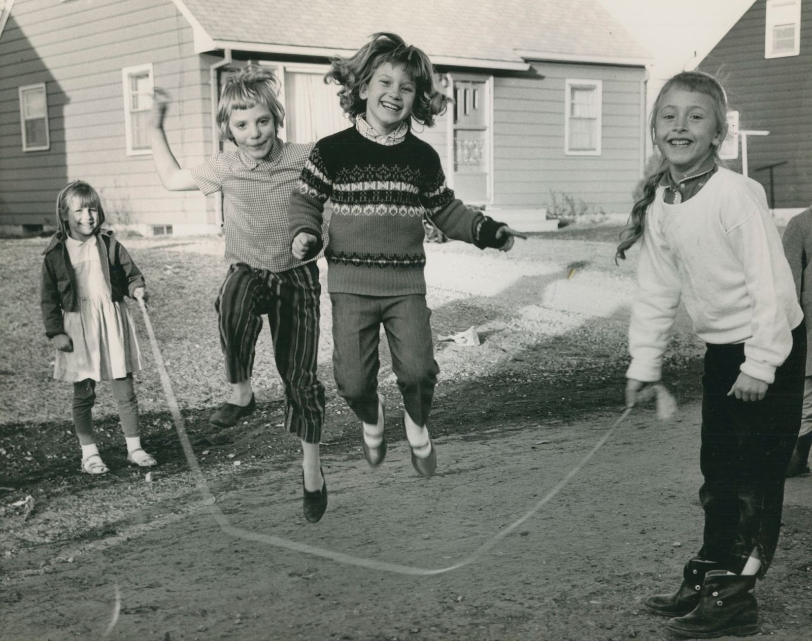
“FI0008309,” Fort Dodge, IA, 1965 by Shannon Camden/Fortepan Iowa, “https://fortepan.us/photo/FI0008309/,” CC-BY-SA 4.0
This image of the girls jump roping is just that – it feels balanced, but it is far from boring! The girls are jumping up close to the top of the frame, but they aren’t being pulled out of it; but by being near the top of the frame, you get the sense they are leaping up rather than falling down. The two girls on opposite sides (holding the rope) are both pulled to the left and right sides of the frames, but this tension is mediated by the two jumping girls in the middle.
Rule of thirds
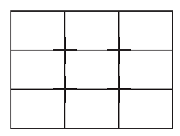
In fact, the “rule of thirds” principle offers some loose guidelines for image creators towards developing both dynamic and pleasing designs and images. The idea is to divide any image into a grid with nine equal rectangles, with crosspoints on the thirds. When one places a form (or forms) on any of these crosspoints (either horizontally or vertically), there is less pulling but enough decentering that the image is aesthetically pleasing but neither inert nor imbalanced/tense.
The rule of thirds has become such a prominent principle of image and photographic composition that abiding by these guidelines may even be interpreted today as a bit dull. However, let’s see the principle in action with this photograph:
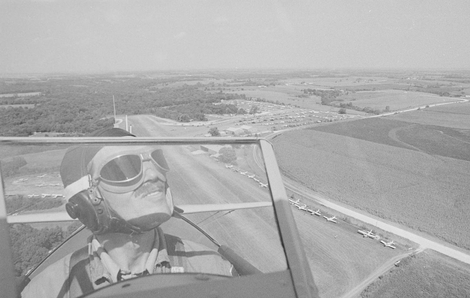
“FI0012754,” Ottumwa, IA, 1976 by LeAnn Lemberger/Fortepan Iowa, “https://fortepan.us/photo/FI0012754/,” CC-BY-SA 4.0
The pilot’s lips and partial smile rest exactly on the first vertical third of this image and the bottom horizontal third.
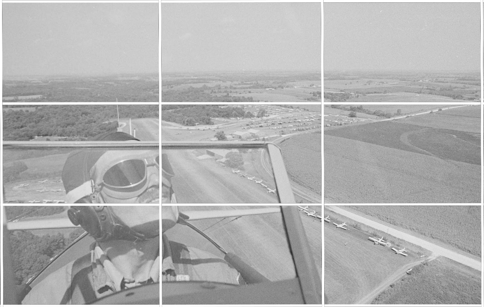
Viewers actually linger on his lips, the most interesting part of the photograph, follow his gaze across the photograph, and delight in this feeling of flying.
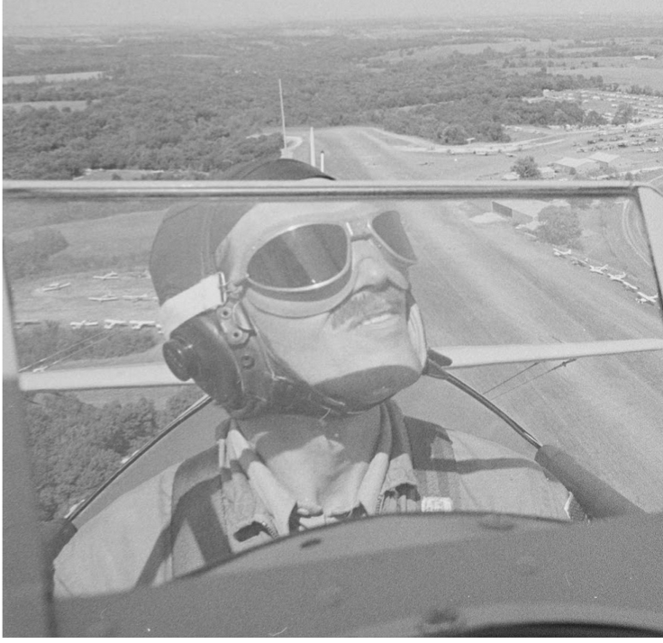
See how much less dynamic this photo is when the pilot is centered?
Knowing how the “rule of thirds” works, and how to break the rule to increase tension or add inertia–and further control meaning–is to be an informed creator, someone who can successfully employ part of the artistic vocabulary of visual communication.
ACTIVITYFrame magnetism practice Find a photograph with people in it. To control the aesthetic pleasure and meaning of this photo, crop it in different ways to better understand the principles of frame magnetism and the rule of thirds. |
Shapes
Shapes (squares/rectangles, circles, and triangles), which are tied to form, have an expressive force all their own. Designer and theorist Johannes Itten summarized the power of shapes to construct visual meaning, “The square is resting matter, the triangle is thought, and the circle is spirit in eternal motion.”[8] We explain why below.
Squares
A square or rectangle within a two-dimensional frame conveys reliability, stability, solidity, confidence, and strength.
FI0001595,” Cascade, IA, 1949 by Mariann Cigrand/Fortepan Iowa, “https://fortepan.us/photo/FI0001595/,” CC-BY-SA 4.0
Circles
In contrast to squares, circles are fluid, unchallenging forms, expressing a sense of completion, entirety, unity, motion, and even happiness. They don’t tend to direct a viewer’s attention in one direction, and bring harmony within the frame.
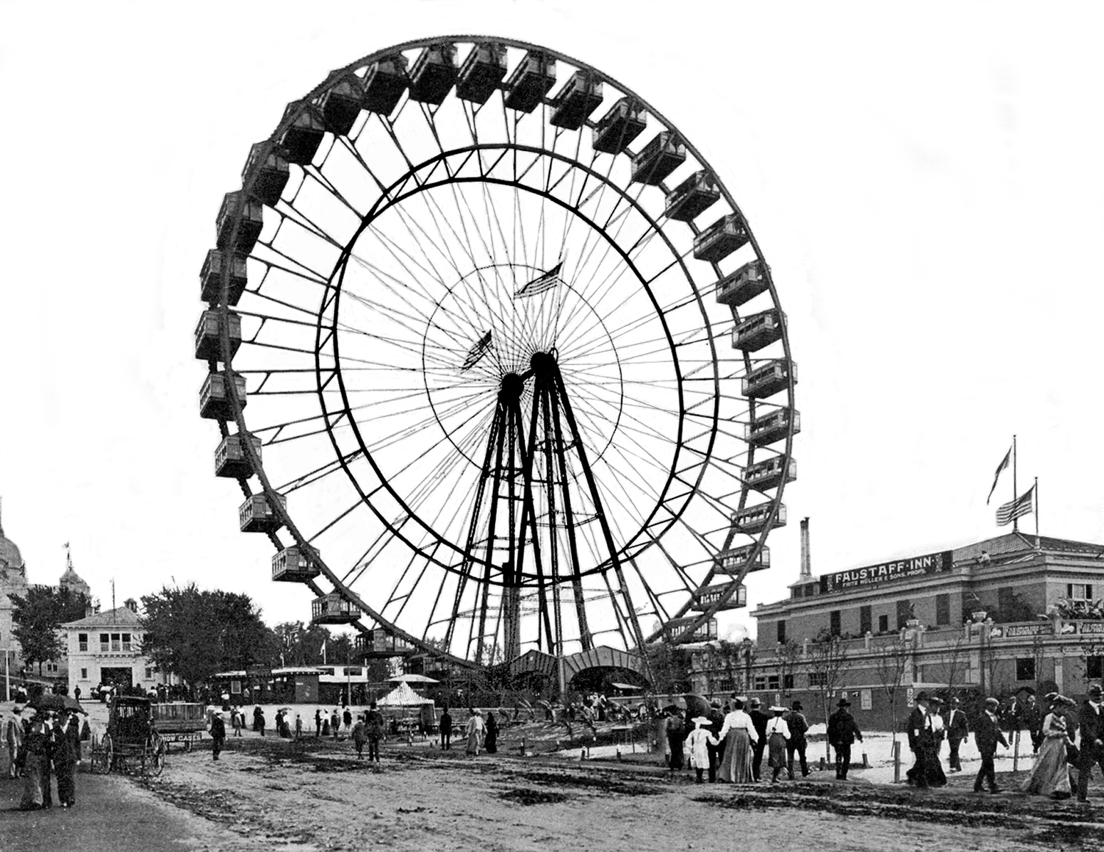
“FI0012668,” Chicago, IL, 1893 by LeAnn Lemberger/Fortepan Iowa, “https://fortepan.us/photo/FI0012668/,” CC-BY-SA 4.0
Triangles
There is no shape more interesting than a triangle. Why? Triangles have the power to point: they create lines and vectors that direct viewers’ eyes up, down, over, and outside of the frame.
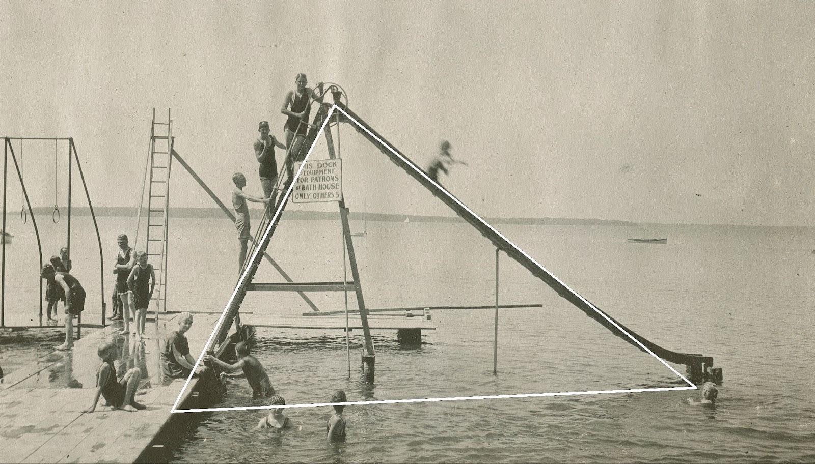
“FI0010672,” Clear Lake, IA, 1917 by Doug McMurray/Fortepan Iowa, “https://fortepan.us/photo/FI0010672/,” CC-BY-SA 4.0
In this image of fun water recreation, the ladder and slide create a triangle that directs the viewer’s eye up to focus on the folks on the top of the ladder, before bouncing around to other parts of the photo.
Pointing is a powerful tool to draw attention to a particular subject or object within a frame, or to draw attention to what might be imagined beyond the frame.
The actual shape need not be explicitly present in a photo for the photo to be composed using that shape. Sometimes multiple forms together create a triangle, as in the photo example: The two lines of people on either side of the table, which lead our eyes again to the focal point: a man in a bright red shirt sticking his tongue out (and pointing with his elbow, which maybe prompts us to notice the reddish car).
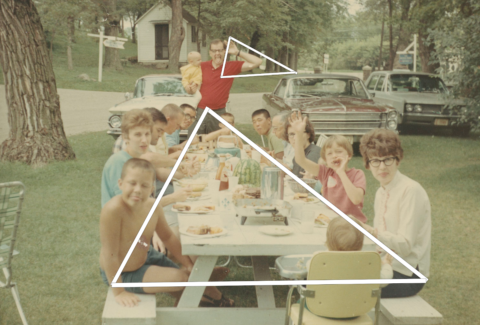
“FI0004846,” Okoboji, IA, 1968 by Mary Scheve/Fortepan Iowa, “https://fortepan.us/photo/FI0004846/,” CC-BY-SA 4.0
Lines
Lines within a frame can also bring harmony, vitality, or drama.
Horizontal lines
Horizontal lines signify peace and stability.
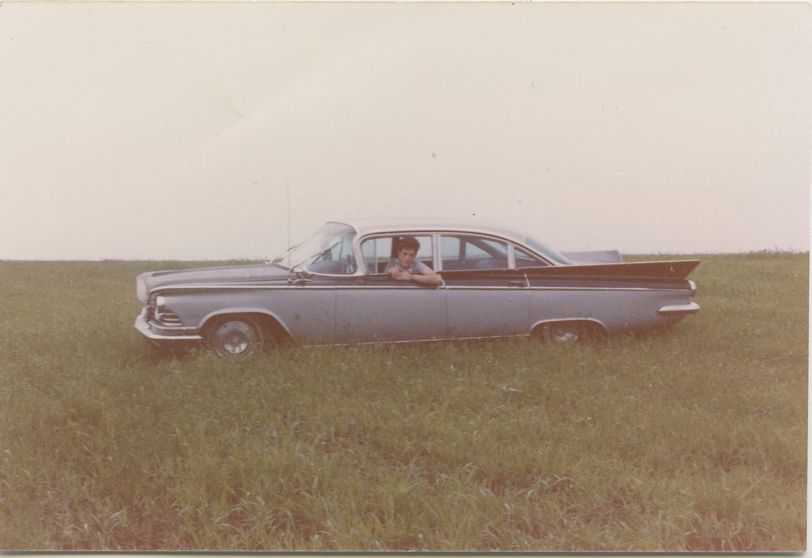
“FI0006163,” Grinnell, IA, 1973 by Barnum, Mary/Fortepan Iowa, “https://fortepan.us/photos/FI0006163,” CC-BY-SA 4.0
In this image of a car in a field, multiple horizontal lines create a sense of stability: the line of the horizon, the lines on the car, even the line created by the man’s arm.
Vertical lines
Vertical lines bring more upward thrust and energy, and often contrast vigorously with horizontal lines. For example, you read the trees in this image from bottom to top (up) rather than top to bottom – you will learn why in the MOVEMENT section of this chapter.
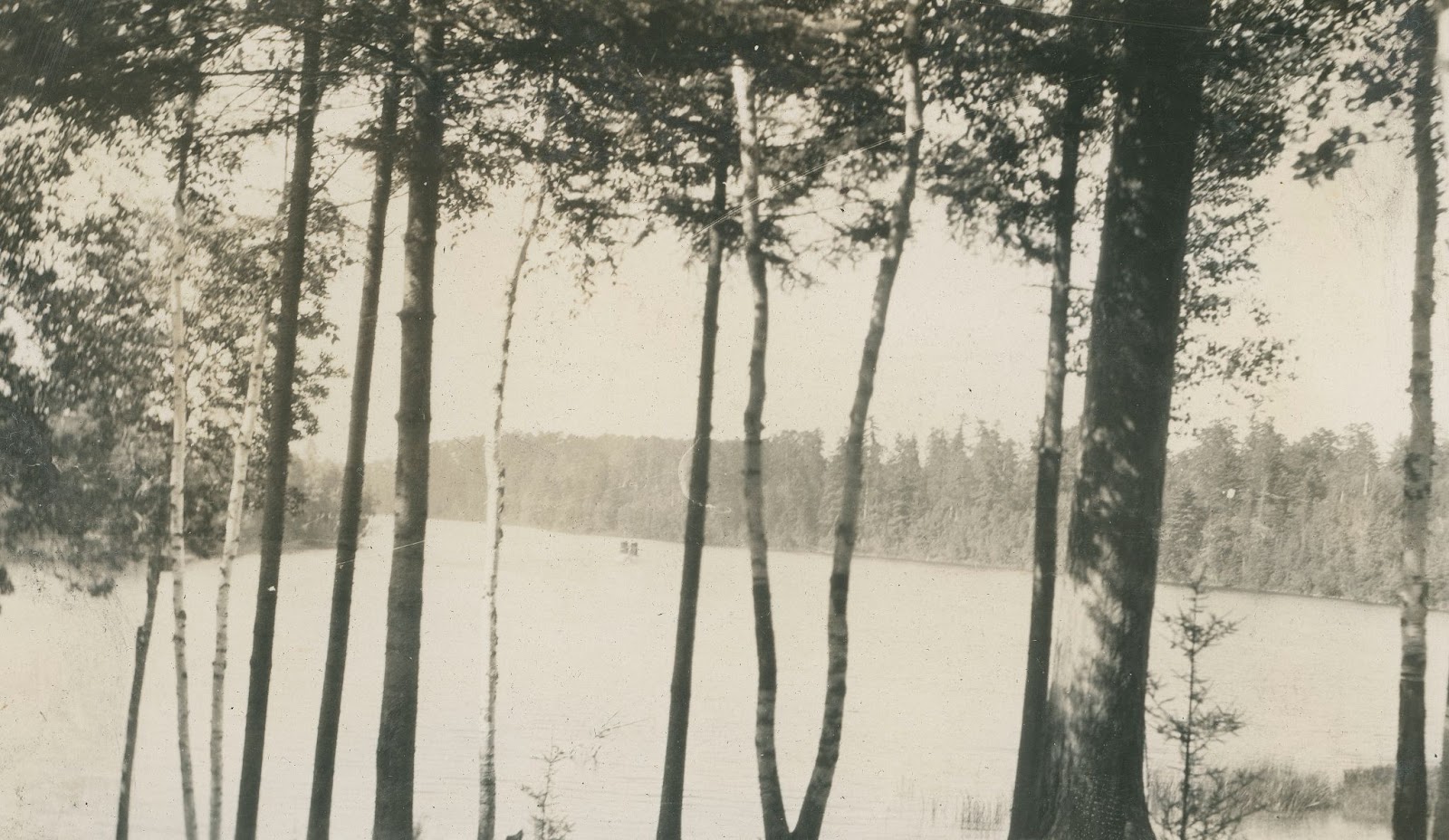
“FI0010948,” MN, 1927 by Doug McMurray/Fortepan Iowa, “https://fortepan.us/photo/FI0010948/,” CC-BY-SA 4.0
Diagonal lines
Diagonal lines, which are often tied to triangles, can convey meaning by dynamically directing the eye across an image, and sometimes slicing the photograph or design in really interesting ways, pointing and instructing us to one or multiple focal points.
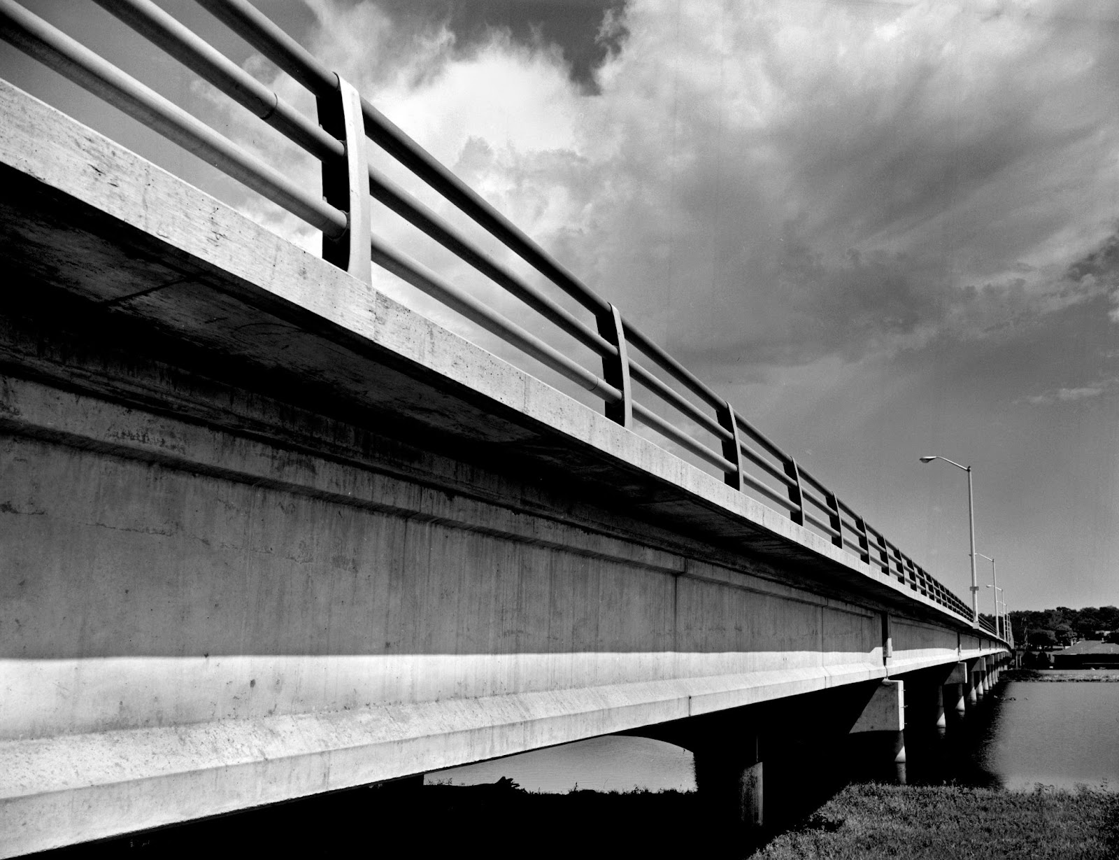
“FI0012713,” Ottumwa, IA, 1965 by LeAnn Lemberger/Fortepan Iowa, “https://fortepan.us/photo/FI0012713/,” CC-BY-SA 4.0
A Dutch angle – when a photographer cocks the camera to tilt the horizon line while taking a photo – is another way photographers can add additional tension, queasiness, instability and directionality in the frame, even if it’s accidental. The Dutch angle positions the viewer as though they are off balance, tilted by some force so that the horizon is not horizontal.
FI0001566,” Location: n/a, 1965 by Gene Pettit/Fortepan Iowa, “https://fortepan.us/photo/FI0001566/,” CC-BY-SA 4.0
Pharmaceutical commercials have relied on Dutch angles, especially in the 2000s, like this Tums commercial, to visually signify a feeling of discomfort, and then shift to a horizontal framing when the patient is “cured.” Web and graphic designers tilt the grid to energize text, graphics, and images. Diagonal lines are essential tools in the visual toolbox.
Lines can be obvious, like telephones, trees, structures, or this lightning strike that divides the frame.
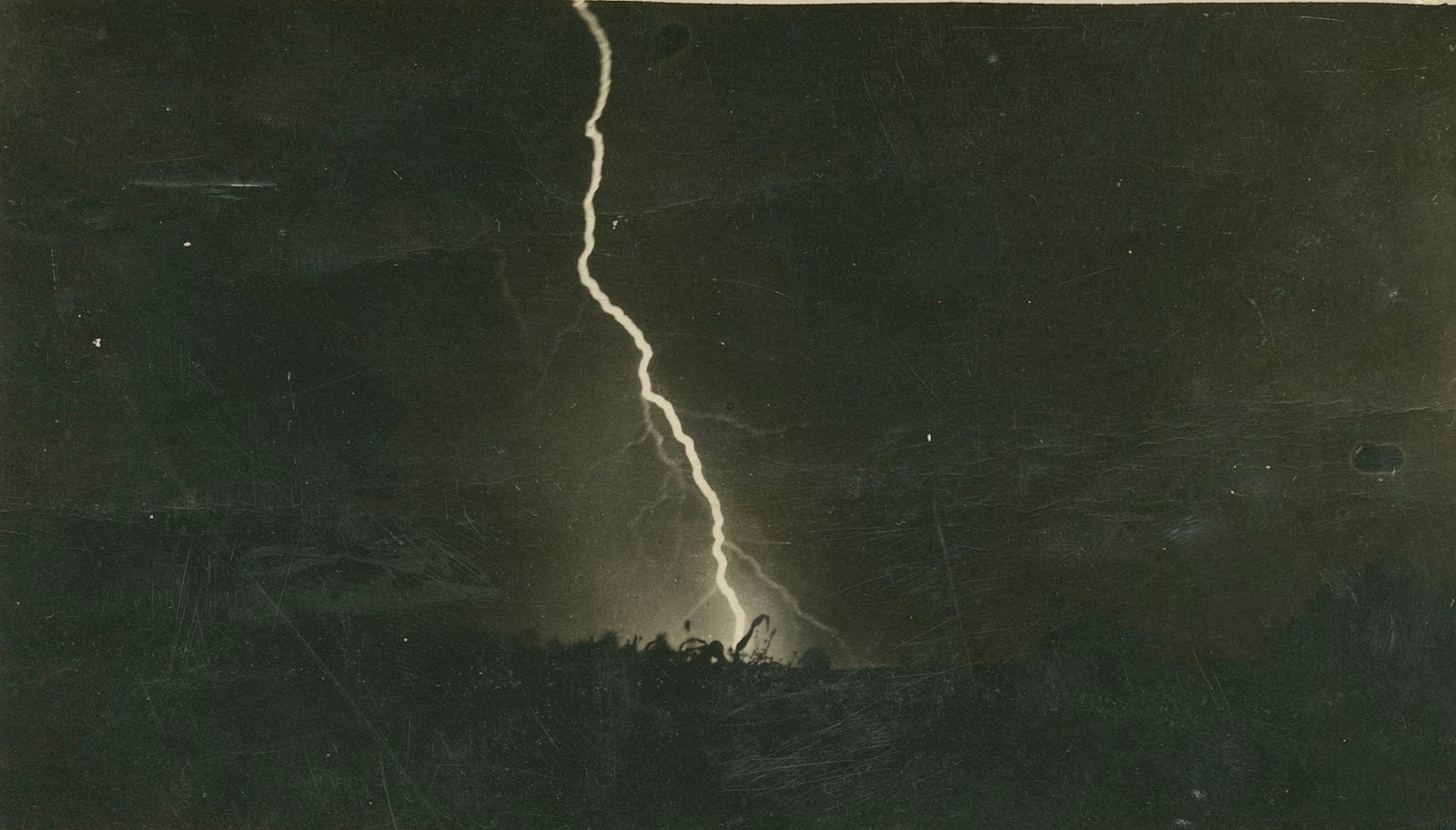
“FI0005552,” Watkins, IA, 1914 by Catherine Palczewski/Fortepan Iowa, “https://fortepan.us/photo/FI0005552/,” CC-BY-SA 4.0
But other lines can be inferred. Below, the man is looking to the right, well beyond the frame, and we follow the line created by their gaze.
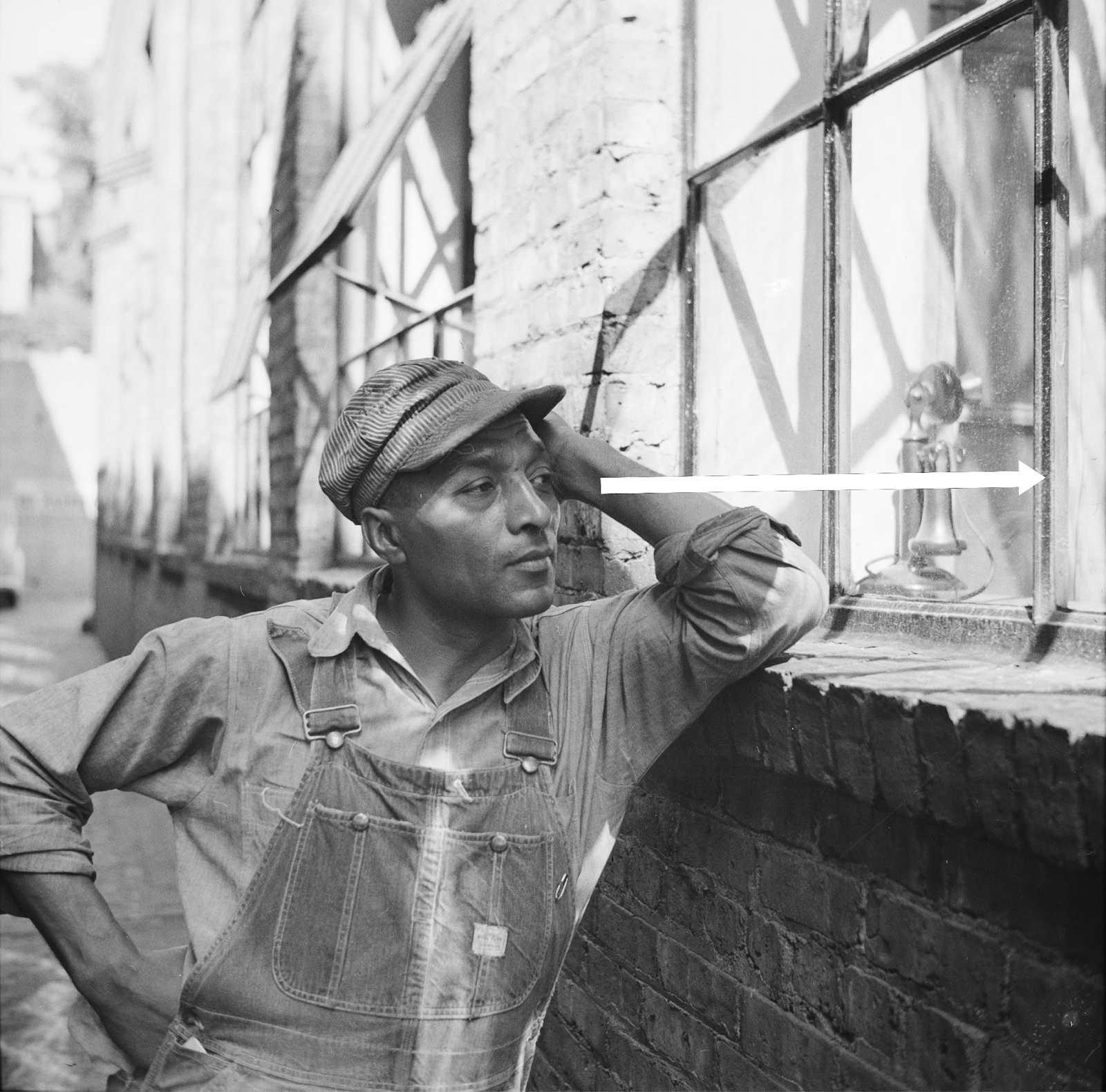
“FI0015411,” Ottumwa, IA, 1939 by LeAnn Lemberger/Fortepan Iowa, “https://fortepan.us/photos/FI0015411,” CC-BY-SA 4.0
Similarly, an invisible line is created in this photo through a man’s pointing and by the positions of family baseball players.
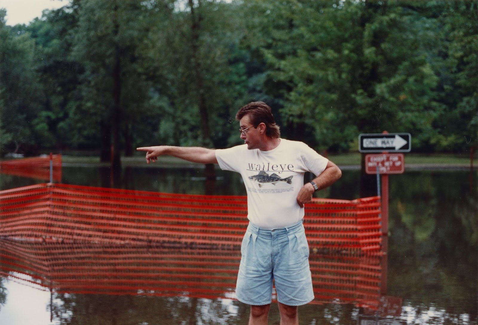
“FI0006594,” Central City, IA, 1993 by Linda Merck/Fortepan Iowa, “https://fortepan.us/photo/FI0006594/,” CC-BY-SA 4.0
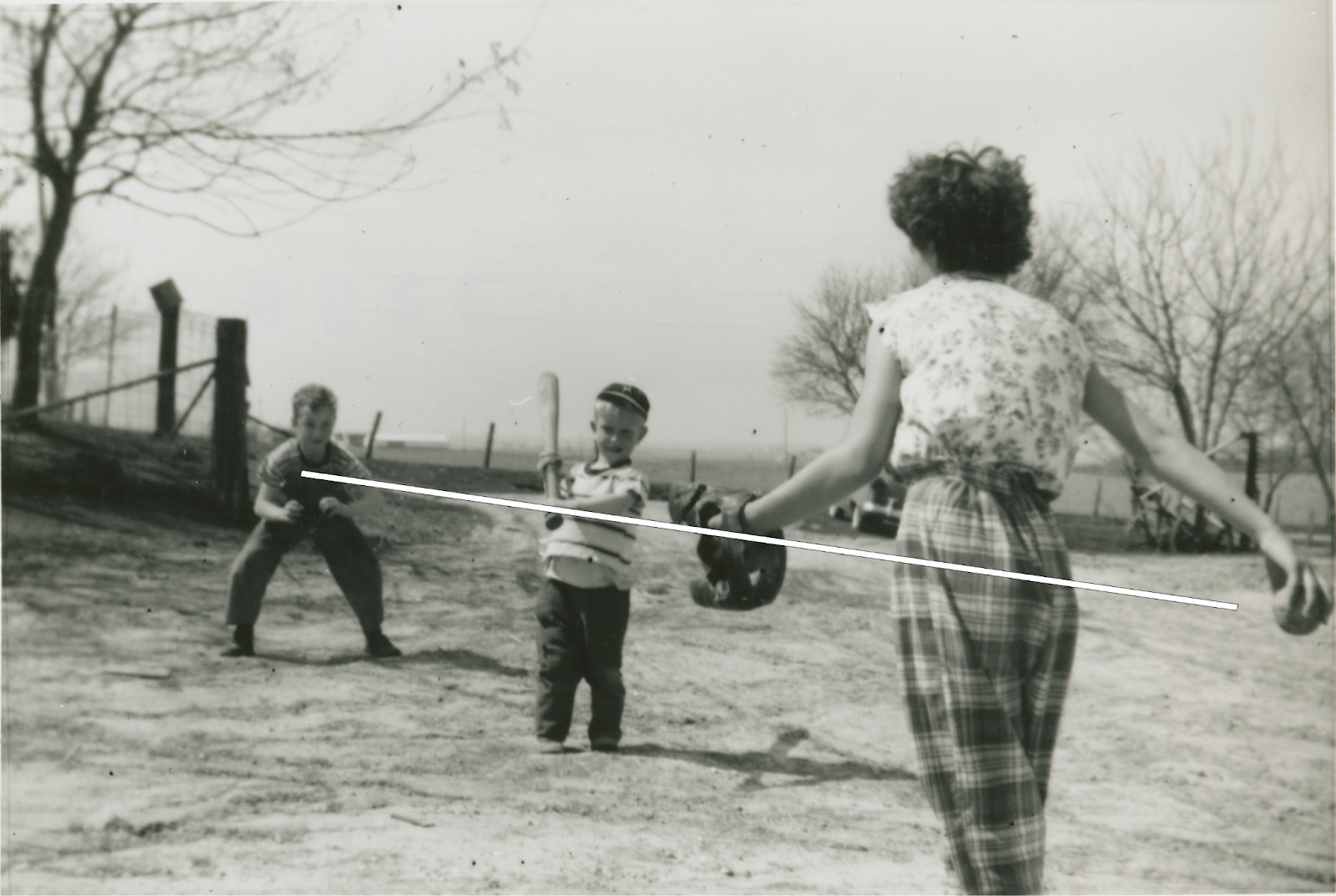
FI0003194,” Colesburg, IA, 1950 by Lois Forkenbrock/Fortepan Iowa, “https://fortepan.us/photo/FI0003194/,” CC-BY-SA 4.0
Lines created by high and low angles
Lines created by angles (or the relational position between subject and photographer) can also add depth. Standing high and shooting downwards, as in this photograph of a choir rehearsal, creates an exciting invisible diagonal line between photographer and subject. Because high angle photos situate the photographer above their subject(s), they can construct an additional layer of meaning, making the subjects seem weaker, smaller, and less powerful. The higher the angle, the more diminished the subjects.

“FI0001663,” IA, 1950 by Jesse Henderson/Fortepan Iowa, “https://fortepan.us/photo/FI0001663/,” CC-BY-SA 4.0
Alternatively, photographers can dramatically increase their subject’s stature by capturing a figure at a low angle from below. This gas station attendant shown below seems larger than life, as does the nozzle he is holding, which creates a prominent line in the photograph that directs a viewer’s gaze to the left.
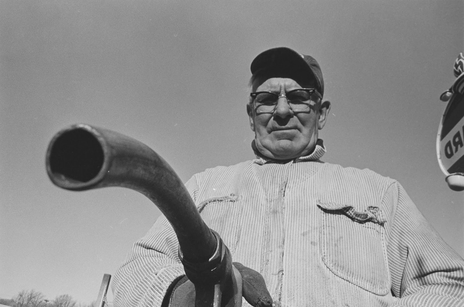
FI0015253,” Ottumwa, IA, 1966 by LeAnn Lemberger/Fortepan Iowa, “https://fortepan.us/photo/FI0015253/,” CC-BY-SA 4.0
Whether they are visible or invisible, or part of high or low angles, lines work together to communicate spatial arrangements and corresponding relationships within a visual narrative.
Movement
Because you are reading this text in English, you are reading with a Western orientation, moving across these words from left to right. You may not realize this, but people who grow up reading Western languages also “read” images left to right. Reading images left to right inherently adds movement to an image and affects the way we perceive motion captured within a frame. In contrast, people who grow up reading Eastern languages, like Arabic or Hebrew, read both text and visuals right to left, and Chinese, Vietnamese, Korean, and Japanese people are trained to read both words and images from top to bottom and right to left.
When operating in a Western orientation, think about how Westerners might read these two images that show slopes. Which shows an uphill grade and which shows downhill?
Image 1, “uphill” Image 2, “downhill”
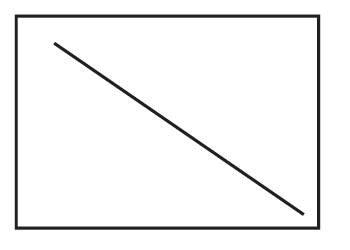
Those with a Western orientation will read Image 1 as “uphill” and Image 2 as “downhill” because of their left-to-right orientation. Again, people growing up speaking and reading Arabic or Hebrew languages that are written right-to-left, would read Image 1 as “downhill.”
While visual communication is, in some ways, culturally specific, line direction is another powerful way for an image creator to control the meaning of a photo or design, and thereby control a viewer’s emotions by working with (or against) the motion depicted within an image. For example, this photo shows two boys running left-to-right (they are about to jump through a sprinkler outside of the frame). From a Western orientation, they seem to be running quite fast because we are also reading left to right, which adds to and almost accelerates their movement.
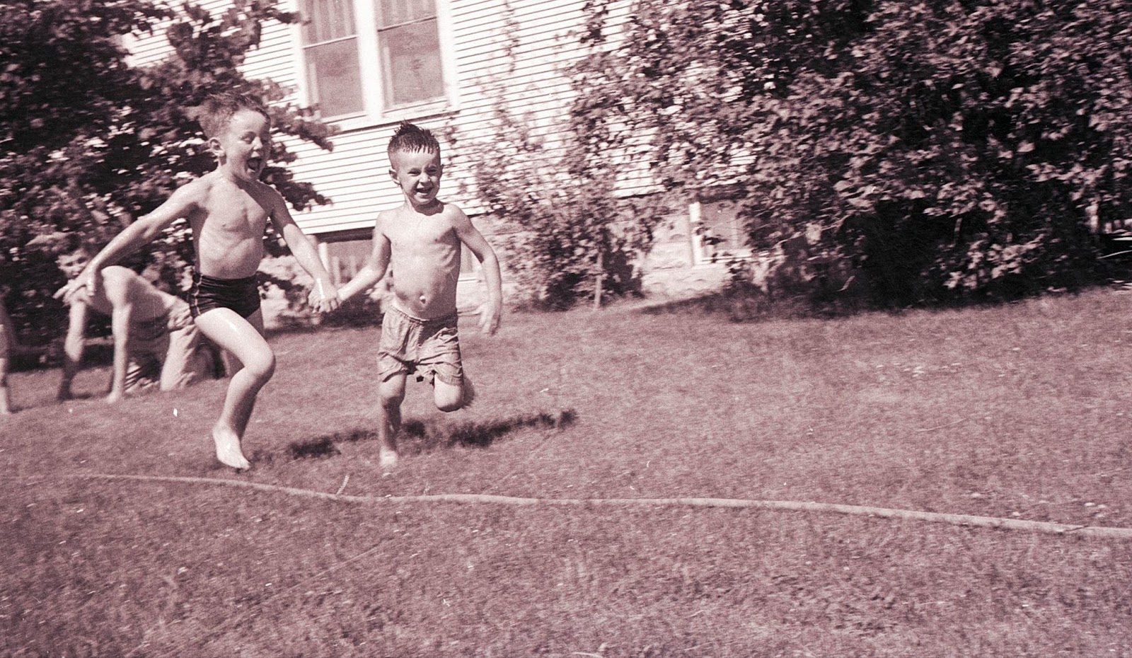
“FI0004691,” Orange City, IA, 1958 by Howard Lyon/Fortepan Iowa, “https://fortepan.us/photo/FI0004691/,” CC-BY-SA 4.0
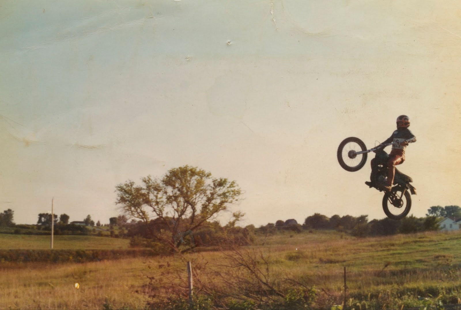
Another example is the motion of this motorcyclist. Positioned left to right, the cyclist seems to be picking up speed.
“FI0001079,” Des Moines, IA, 1975 by Kelly George/Fortepan Iowa, “https://fortepan.us/photo/FI0001079/,” CC-BY-SA 4.0.
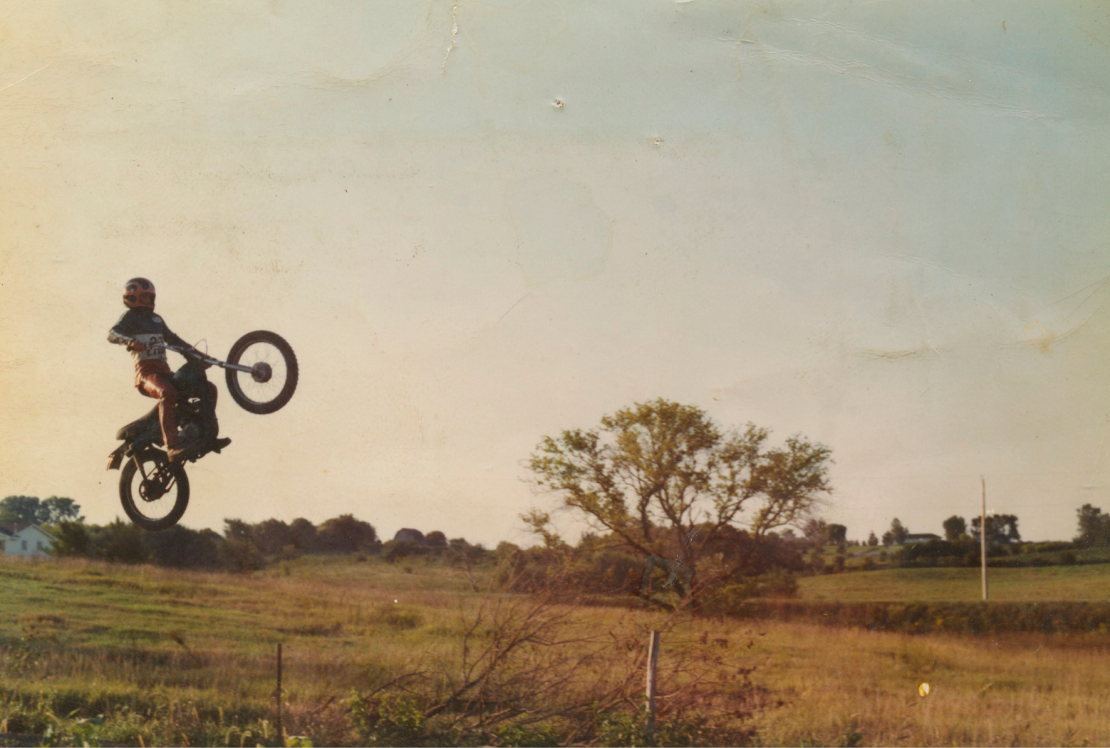
But change the orientation to left to right, and Western-reading audiences will read against the movement of the motorcycle (left to right), so with this very same image, the biker seems suspended in the frame, like slow motion.
To capitalize on these tendencies, an image creator wanting to convey a truck or jeep as tough will likely depict the vehicle climbing up the “downhill” slope, and show the truck work against the left-to-right momentum (proving to be all that tougher). Likewise, an image creator wanting to depict speed will position the vehicle moving from left-to-right, making it travel down the “downhill” slope, where it seems it travels even faster.
Look at this Ford Explorer and Mitsubishi Triton television advertisements,[9] which use typical strategies for communicating “speed” vs. “toughness.” For “speed,” the truck is shown traveling left to right. For “toughness” the truck is shown going “right to left” and often going up the downhill slope in order to adequately communicate how much more energy is required to travel “against the grain.”

https://www.youtube.com/watch?v=qmmjSJ5brU8
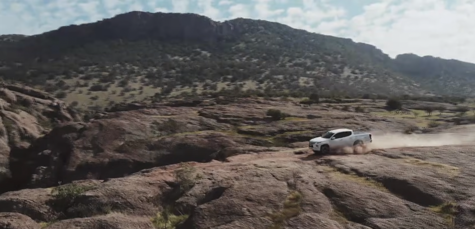
https://www.youtube.com/watch?v=gytXaAtcsxM
When producers add video or film camera motion, there is even more power to convey speed or stasis. If the camera moves horizontally (tracking or panning) left to right while something like a truck is also moving left to right motion, and while a reader (viewer) of that image is also reading left to right, one can add speed on top of speed and even create a sense of panic. Similarly, horizontally tracking or panning a camera right to left gives producers the power to calm things down. Applying this strategy to any kind of movement (walking, biking, boating, crawling, etc) and producers can convey anxiety and trouble or dignity and aplomb. Add strategies like frame magnetism, or high/low angles and producers have many tools in their toolkit to control the message and move the story forward.
The way image creators position people looking is another chance to infuse an image with meaning. For Western-reading audiences, a person looking to the right is a way to convey “looking into the future” because left to right feels “forward.” As you see here, Western audiences are primed to imagine these two 19th century hikers, pictured below, as “gazing into their futures” – what kind of life will they build above the Mississippi River?
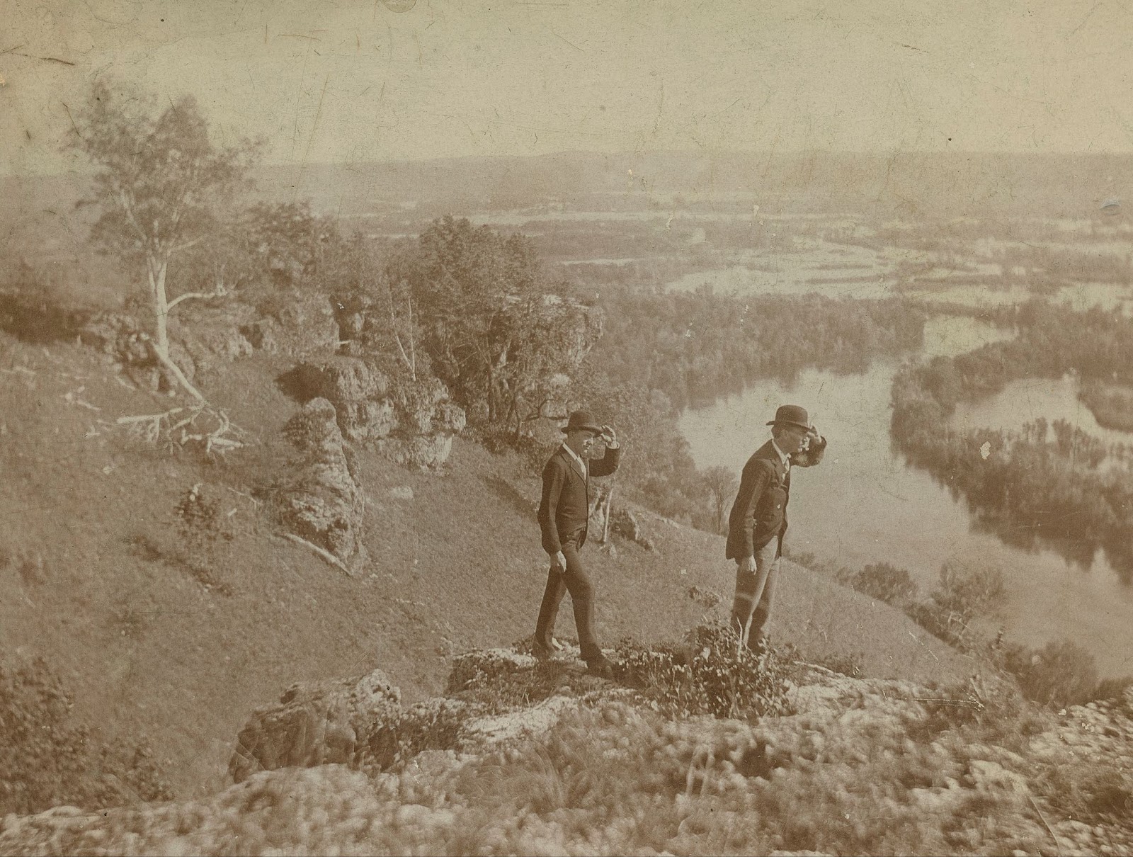
FI0009630,” Lansing, IA, 1893 by Ann and Jons Olsson/Fortepan Iowa, “https://fortepan.us/photo/FI0009630/,” CC-BY-SA 4.0
Visualizing people right-facing “the future” is a frequent tactic for advertisements for financial services (save for the future), as in this still from a U.S. bank ad.[10]
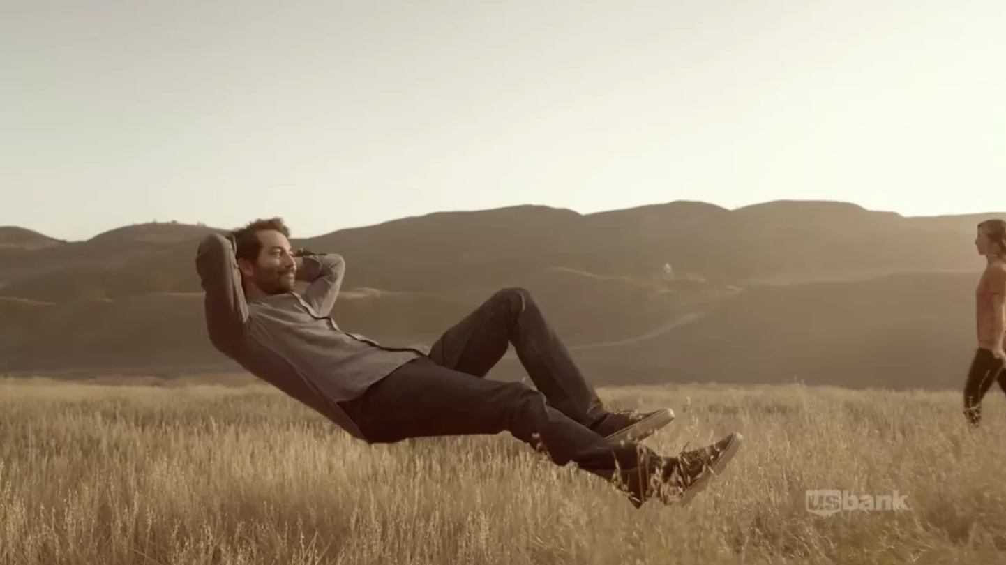
https://www.adweek.com/creativity/us-banks-new-ads-imagine-future-thanks-some-clever-visual-tricks-169183/
Political campaigns also tend to choose right-facing imagery (“I will lead you into the future”), evident in this 2018 Ron DeSantis campaign ad below:

Political mailer from Ron DeSantis’ 2018 campaign for Florida governor.[11]
Meanwhile, portraying a person as looking towards the left side of the frame is a way to depict someone “looking to the past.” Image creators use this tactic to evoke introspection or regret: they are looking backward, against the grain.
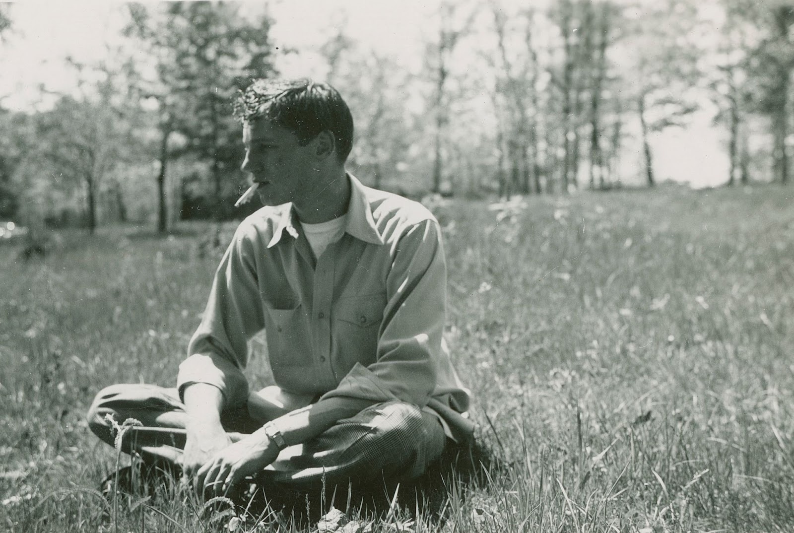
“FI0009838,” West Union, IA, 1944 by Janna Fink-Bowman/Fortepan Iowa, “https://fortepan.us/photos/FI0009838,” CC-BY-SA 4.0
This tactic can also make someone look “backward.” Do a search for oppositional political advertising and witness the many attempts to make a political candidate look “bad,” which often means making them look to the left.
Vectors
These directional forces are “vectors,” and there are three kinds.
- Continuous vectors, like the ones described above, extend beyond the frame and can give a viewer pause or apprehension, because we don’t exactly know when the motion stops (especially if the motion is left to right). This photo below shows a clear motion vector from left to right as the runners complement your own left to right orientation, adding speed and vigor to this image.
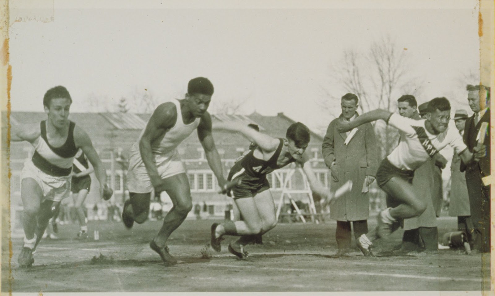
“FI0017037,” Storrs, CT, 1936 by Archives & Special Collections, University of Connecticut Library/Fortepan CT, “https://fortepan.us/photos/FI0017037,” CC-BY-SA 4.0
- Converging vectors, where the motion is completed within the frame itself, do the opposite: by converging they are much more calming because they represent a sort of resolution. As the baseball player slides into base (and almost into the catcher), one can imagine the motion completing a few seconds after the photo was taken. Both the motion of the sliding baseball player and the catcher converge.
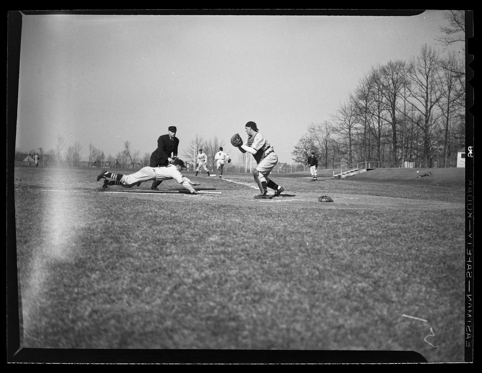
“FI0016528,” Storrs, CT, 1943 by Archives & Special Collections, University of Connecticut Library/Fortepan CT, “https://fortepan.us/photos/FI0016528,” CC-BY-SA 4.0
- Diverging vectors, where two moving forces each leave the frame in opposite directions, can create a very troubling feeling, and is a favorite tactic of professional photographers, both to add motion and to unnerve the viewer so they’ll linger on the photograph and search for meaning. In the image below, the two teams are moving away from each other and also out of the frame. It’s not clear where they will end up or what will happen in the minutes after the image is taken. There is no resolution and this adds tension to the image.
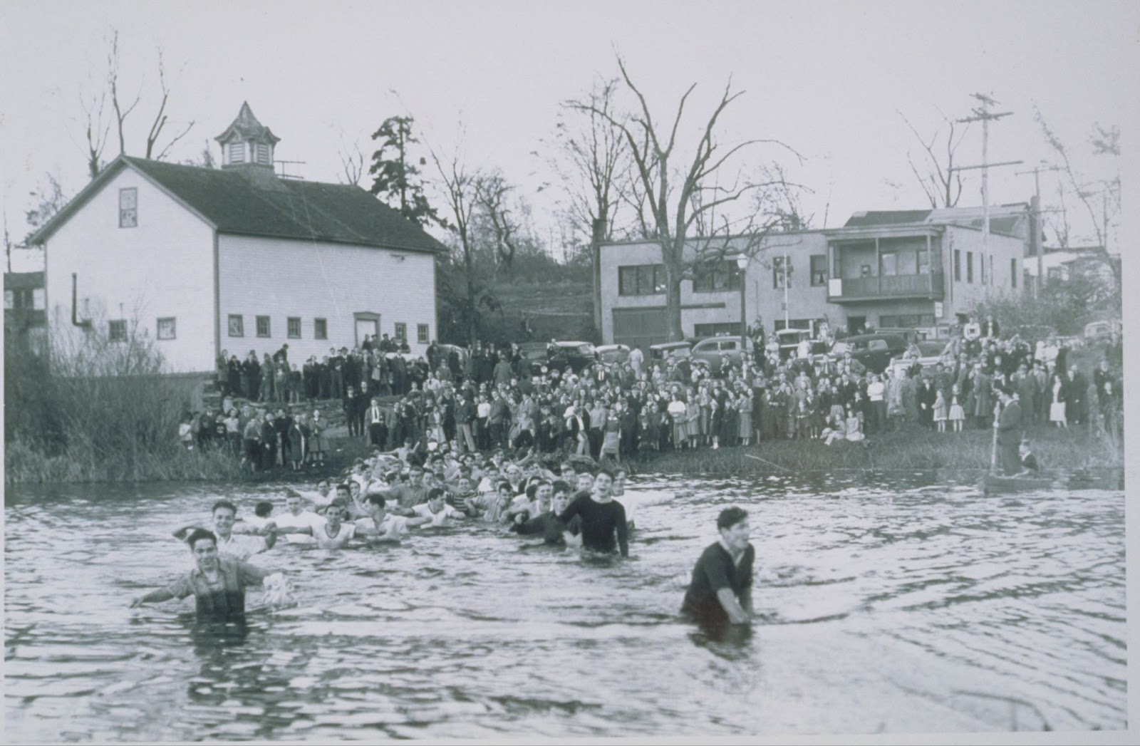
“FI0016596,” Storrs, CT, 1935 by Archives & Special Collections, University of Connecticut Library/Fortepan CT, “https://fortepan.us/photos/FI0016596,” CC-BY-SA 4.0
Combining these directional forces with a viewer’s left-to-right orientation can add compelling storytelling capabilities and even drama to a still image, and enormous tools to a photographer’s or graphic designer’s toolbox.
Punctum
Roland Barthes was a French literary theorist who wrote an important book about photography called Camera Lucida (1980). In this book, Barthes analyzed the nature of photography and the effect photographic images have on viewers. In doing so, Barthes introduced two concepts: studium and punctum.
Studium is the background of a photograph, the bed on which the image rests, including whatever a person might bring to interpreting the photo and the context in which it has been created (its original purpose and function). As background information, studium is more passive and even boring or banal.
Punctum is the thing that pierces the studium. The term is derived from the scientific process of puncturing or pricking a sharp metal object into bodily tissue, or a variation in bodily tissue.
Barthes employed the term punctum to mean a prick of visual pleasure or interest in a photograph. It’s the part of the photo that makes you look again, that holds your attention, and that makes the photograph delight you. Punctum does not have to be evident in all photographs, and is actually very subjective. However, punctum is what makes a photograph special or memorable. It could be an expression on a person’s face, the way a light shines in a certain corner of the photo, even a discoloration on the original print that adds a layer of beauty, a point of amusement, a piece of symbolism, or something personally profound.
Here is an example of punctum: a wedding family snapshot from 1950. You can tell it’s a wedding because the information on the Fortepan.us/Iowa website says “Ann and Alan
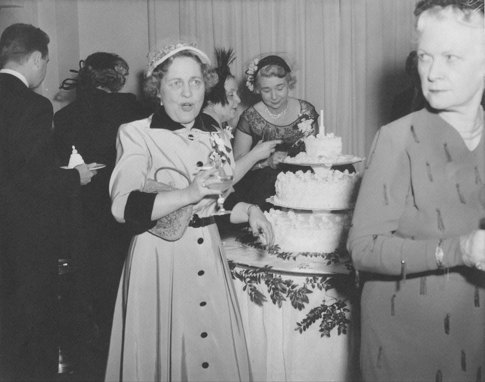
“FI0001840,” Omaha, NE, 1950 by Ann Potter/Fortepan Iowa, “https://fortepan.us/photo/FI0001840/,” CC-BY-SA 4.0
Potter’s wedding” and that it comes from Ann Potter’s collection (one other photo documents this wedding, and can be found here). In this photo, you can see a wedding cake and the people in the photo are dressed fancier than normal day dress in Iowa during the 1950s. This is the studium: it’s banal – lots of wedding photos feature wedding cakes and guests, and there is no information on the people’s identity in the photograph.
However, the photo might cause you to linger for multiple reasons. First, you might find punctum in the face of the woman speaking (possibly in mid-sentence): She has an unusually vigorous and animated expression directed at the woman in front of her, who is turning her head. You might first look at the woman speaking (and imagine what she is saying and how loud they are talking) then analyze the second woman’s expression: Whoa! Is she surprised or annoyed? Why the impressive side eye? The punctum is the dynamics of this potentially tense relationship. Second, one might find punctum in the manner in which the first woman is holding her cigarette, and the wine glass in her right hand. It’s a small detail, but a delightful one.
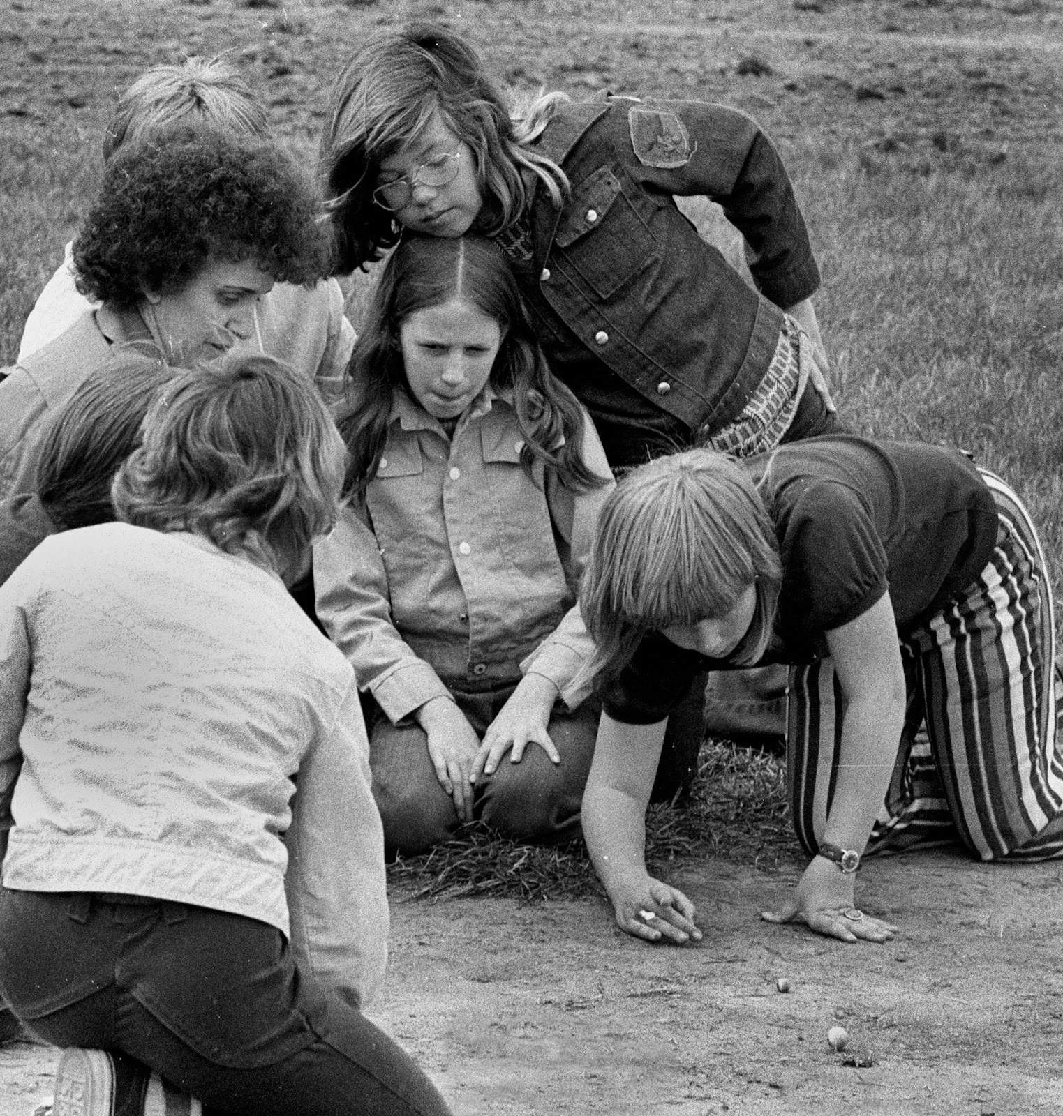
Where do you find punctum in this photograph below?
“FI0013039,” Ottumwa, IA, 1976 by LeAnn Lemberger/Fortepan Iowa, “https://fortepan.us/photo/FI0013039/,” CC-BY-SA 4.0
REVIEW QUESTIONS
1. Why is the color red so riveting for photographers and designers?
2. How does the rule of thirds work with frame magnetism to create aesthetic balance?
3. Why does a car in a photo or graphic seem like it is traveling faster when it’s moving left to right ? And how does knowing this give us power over how we place images?
4. How can the concepts studium and punctum explain a photo’s power?
ACTIVITIES
Outside of or during class, take your camera outside and try to capture images that correspond to the lessons on color, form, depth, motion vectors, etc. Do it as a group or individually. |
Additional OER Resources from OER Commons:
Angles, Edits and Crops
Related Classroom Activities
[1] Hasan Bashir, John T. Seykora, and Vivian Lee, “Invisible Shield: Review of the Corneal Epithelium as a Barrier to UV Radiation, Pathogens, and Other Environmental Stimuli, National Library of Medicine,” accessed July 28, 2023. https://www.ncbi.nlm.nih.gov/pmc/articles/PMC5525501/.
[2]Natalie Angier, “How Do We See Red? Count the Ways,” New York Times, Feb. 6, 2007.
https://www.nytimes.com/2007/02/06/science/06angi.html; Andrew Stockman and David Brainerd, “Fundamentals of Color Vision I: Color Processing in the Eye,” in Handbook of Color Psychology, ed. A.J. Elliot, M. D. Fairchild, and A. Franklin (London: Cambridge University Press, 2015), 27-69.
[3] J.D Mollon, “‘Cherries among the Leaves’: The Evolutionary Origins of Color Vision,” in Color Perception: Philosophical, psychological, artistic and computational perspectives, ed. S. Davis, 10-39. Oxford: Oxford University Press, 2000; “Cones,” American Academy of Ophthalmology, accessed July 31, 2023, https://www.aao.org/eye-health/anatomy/cones.
[4] Herbert Hoover, “First National Conference on Street and Highway Safety, U.S. Department of Transportation,” May 14, 1926, https://www.careforcrashvictims.com/assets/24P11-Hoover-Address-1924.pdf.
[5] When Burke writes “form is the creation of an appetite in the mind of the auditor, and the adequate satisfying of that appetite”[i] he is not just talking about the length or style of a speech, but also its content. The forms of and in a message are central to its meaning.[i] Burke, Counter Statement 31.[i] Kenneth Burke, Counter-Statement, (Berkeley: University of California Press, 1968), 124.[ii] Burke, Counter-Statement, 143.
[6] R. Arnheim, Art and visual perception: A psychology of the creative eye (University of California Press, 1974); Donald Weismann, The visual arts as human experience (Prentice-Hall, 1970); Herbert Zettl, Sight. Sound. Motion (Wadsworth, 1973).
[7] Bettina Fabos, “Visual Literacy: Aesthetics, Semiotics, and the Truth Behind and Image.” in Media IN Society, ed. J. Jensen, D. Gomery, R. Campbell, B. Fabos and J. Frechette (New York: Bedford/St. Martin’s, 2013), 57.
[8] Johannes Itten, The Art of Color: The Subjective Experience and Objective Rationale of Color (John Wiley & Sons Inc , 1974) p. 120.
[9] “The 2021 Ford Explorer: Performance | Explorer | Ford,” Ford; https://www.youtube.com/watch?v=qmmjSJ5brU8; MITSUBISHI TRITON Pickup Truck Commercial, Mitsubishi, https://www.youtube.com/watch?v=gytXaAtcsxM, both accessed July 30, 2023,.
[10] David Gianatasio, “U.S. Bank's New Ads Imagine the Future, Thanks to Some Clever Visual Tricks,” Adweek, January 25, 2016, accessed July 30, 2023, https://www.adweek.com/creativity/us-banks-new-ads-imagine-future-thanks-some-clever-visual-tricks-169183/.
[11] Drew Wilson, “Koch-backed group launches pro-Ron DeSantis direct mail campaign,” Florida Politics, July 20, 2018,https://floridapolitics.com/archives/269302-freedom-partners-action-fund-launches-pro-ron-desantis-mail-campaign/desantis-mailer-froont.